Settings Design Customisation
Notes, documentation, and best practices for customising your settings section
Table of Contents
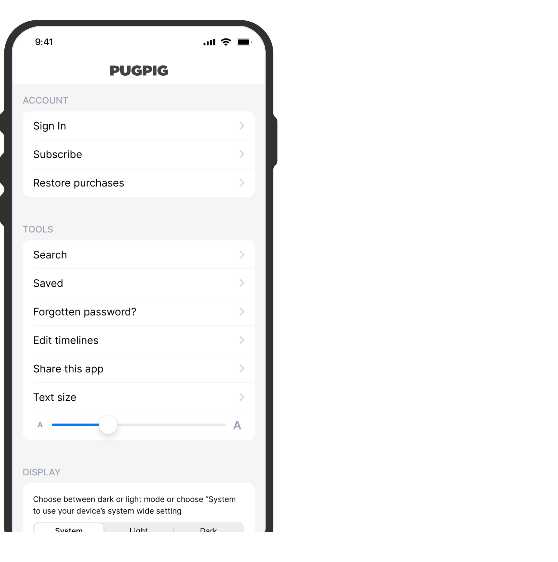
The Bolt settings tab can accommodate a wide range of choices in a table view, allowing you to provide information to your users and enabling them to personalise their in-app experience. It encompasses account options, traditional settings, and even debugging choices, rendering it a nearly indispensable component of the app.
Defining the location of your settings
Since the settings function is presented as a tab, it is commonly positioned within the app's bottom tab bar. It can occupy any of the 3-5 available slots, but it's often situated as the last item on the tab bar. Additionally, you also have the option of featuring the settings as an icon in the toolbar, located at the top-right corner of the app.
Defining the settings page
You have the flexibility to divide your settings page into as many sections as desired. This proves especially advantageous for distinguishing between account-related choices and user customization preferences. You can opt to provide headers for these sections, or leave them without, depending on your preference.
Defining the content and appearance
Here's what it could consist of:
- Custom banners (this is an optional image, text and CTA button that can be displayed at the top of the settings area )
- External links (e.g. to privacy policy, T&Cs)
- Link to HTML settings pages hosted by us
- Saved articles
- Search
- Default options for sign in/subscribe/restore if you have subs
- Test resize
- App share
- App theming
- Edit timelines


