App Customisation Guidelines
A design guide for customising your Bolt app.
Table of Contents
This guideline is for those who want to customise their app using our out of the box feature. If you want to explore customization options beyond our standard features you can speak to our CSM to determine if we can support your request and layout.
You can view a document detailing our standard features and layout here.
We will need you to supply the following to kickoff:
- Brand colours (in hex ref) and what parts of the app they should apply to. If you would like us to enable dark mode, please also provide the colour palette you would like us to use - or we can infer it from your brand colours
- Fonts (in .ttf or .otf) and where each font should apply to in the app
- Assets e.g logo (176px high, transparent background png) and app icon (1024x1024px png)
Customising the native containers
The native portion of the apps are developed using elements that iOS and Android provide (where possible), which means their UI looks more consistent with their platform. We support theming of these areas so you can apply colours, fonts, and assets to the native containers. There is a standard look and feel across the Pugpig Bolt product, so it is not necessary to build custom designs for these areas.
Areas of the app that can only be themed:
- Welcome screens
- Bottom Navigation
- Top Navigation
- Settings page
Areas of the app we have more flexibility with design:
- Article cards
- Article templates
Welcome Screens
The bolt onboarding or welcome screens play a crucial role in introducing users to your app's features and providing assistance when needed. This enables you to effectively provide information about your app to users, allowing them to discover more about your offerings. Please confirm if you want a welcome screen. And if so, do you have any ideas now on what you want the welcome screens to be.
Checklist for welcome screens:
- Image(Optional) - Include visuals that resonate with your app's style and the content's context. There is not a set recommended size for the images, they get centred in the top half of the screen and will overflow the screen if they're larger than the available space (which varies device-to-device)
- Title
- Description
- Action Buttons: Include buttons with clear labels that guide users to the next step e.g (‘Next’ or ‘Let’s go')
- Include a clear CTA that directs users toward the main app interface. The CTA should be visually distinct and indicate the next step. e.g (‘Skip’)
- Dotted indicators for swiping: If applicable, allow users to swipe through screens for a dynamic experience.
Here are some examples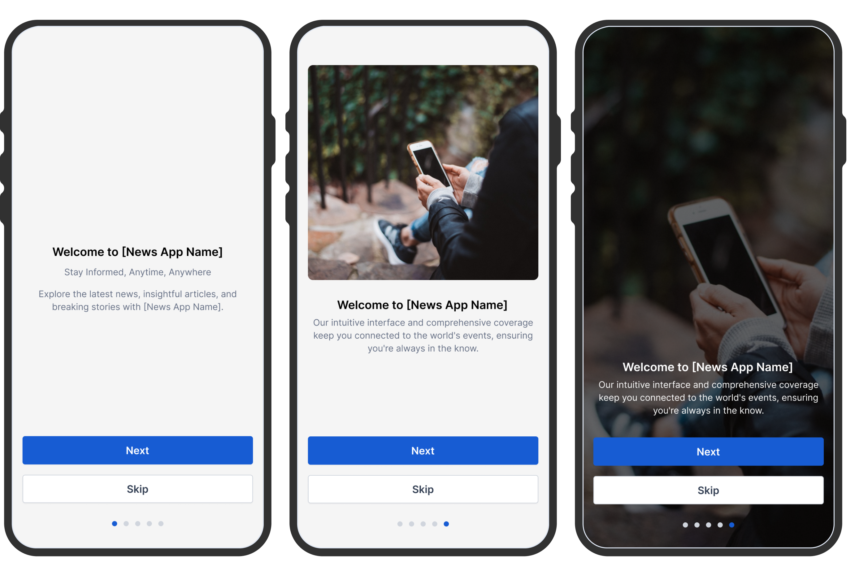
Bottom Navigation
Navigation bars provide a persistent and convenient means to switch between primary destinations within an app. It is generally recommended to have 3-5 destinations in the navigation bar.
Please decide on the number of destinations you prefer and update the design accordingly by increasing the number of segments. You can customise your bottom navigation using the Pugpig Design Kit. This kit offers a wide selection of icons to customize your navigation bar. Provide clear and concise text labels. we strongly recommend one word, not required. These labels should describe the purpose of the navigations elements.
Checklist for bottom navigations
- Please confirm what sections you want in your bottom navigation (up to 5)
- Please confirm and send over what icons to be used for the bottom navigations or confirm if you would like us to use in-house icons
Here are some examples
Top Navigation
Your top navigation includes your logo, icons like settings, save, or search, and tabs that facilitate navigation between related content groups at the same hierarchy level. On any timeline, you can add as many tabs as needed.
Checklist for top navigation:
- Please confirm the title for each tab section. Example below
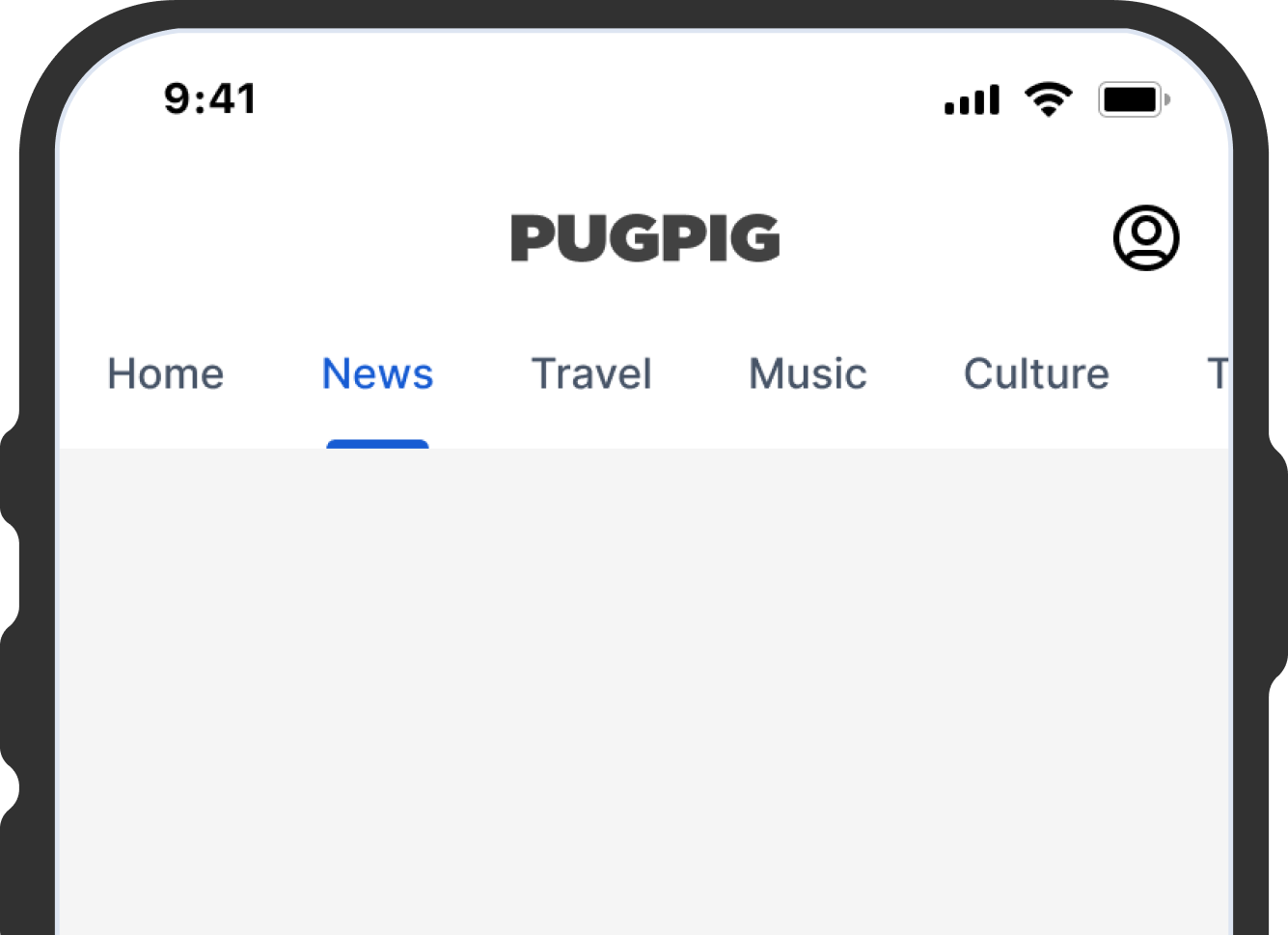
Defining your timelines
Using HTML, CSS and Javascript for our article templates and timelines gives us more flexibility when it comes to styling and branding the apps. Here are the following things you can design:
- Timeline cards
- Can be different per card type
- Can be different per timeline
- You can design from a set of out the box cards
- You can also design custom cards (if applicable) that may contain additional information that a product card cannot support
- Article card layouts
- Can have multiple templates with different styles applied
- We also support different content types e.g events
- Storefront
- Edition table of contents
- Can be different per card type
- Can be different per card type
The following illustrate the various ways cards can be supported in your Bolt timelines. All card configuration is done on your Express CMS site, and information displayed on the card is taken from your content as specified. Any curation or styling rules are set up by our support and development teams before going live.
You have complete flexibility on the design on your timelines, with the ability to customise these based on the size of the screen - timeline layouts.
Card type example designs can be found here
Here are the various card type we currently support:
- Hero cards
- Article cards
- Side by side cards
- Carousel cards
- Explore cards
- Event cards
- Video cards
- Standalone video cards
- Podcast and audio cards
Hero cards
These are visual cards that feature your breaking news or hero stories. They are usually made up of an image and headline and are completely customisable. You could also include a byline, subheading, timestamp or save icon, for example.
Article cards
These are standard timeline cards for delivering articles either with or without an image. These are customisable and could also include the article category, timestamp, read time, save icon or share icon, for example.
Side by side cards
These are half-width cards that sit side by side for delivering articles either with or without an image. Similarly to the standard article cards, these are customisable.
Carousel cards
These are interactive, swipeable carousels for delivering a set of articles with or without an image. Carousels can be customised and can feature the number of articles of your choosing.
Explore cards / Section menu
These cards direct users to dynamically generated timelines, curated by specifically chosen sections. They work by adding link card to your timeline.
Event cards
These cards allow you to highlight upcoming events with information about date, time and location. Events can be added to users' calendars, or include a link to find out more elsewhere.
Video cards
These cards are used for delivering videos that click through to a related article. These usually contain the video thumbnail, headline and article excerpt. You could also include the video category, timestamp, save icon and share icon.
Stand alone video cards
These cards are used for delivering video that isn’t tied to an article. These usually contain the video thumbnail and headline and sit in your video hub. Similar to the video cards, you could also include the video category, timestamp, save icon and share icon.
Podcast and audio cards
These cards are used for delivering podcasts or audio that either stand alone or click through to an article - ie. audio versions of articles for users who prefer to listen. These cards could also include the audio category, timestamp, listen time, the save icon and share icon.
Storefront
The storefront allows users to browse, read and purchase your catalogue of newspapers or magazines. The storefront offers limited customisation out-of-the-box, including all colours, fonts, copy and icons. Elements that offer less customisation are detailed below:
- The arrangement and sizing of covers is fixed
- The presence, position and shape of the view button, download button and edition name
All of the above can be changed with custom css, which would be undertaken by our professional services teams. For each types of cards in the apps.. please confirm what the designs will be here - you can either head to the Pugpig Design Kit and see all of our Out of the Box designs, or please feel free to send across a Figma file containing your designs.
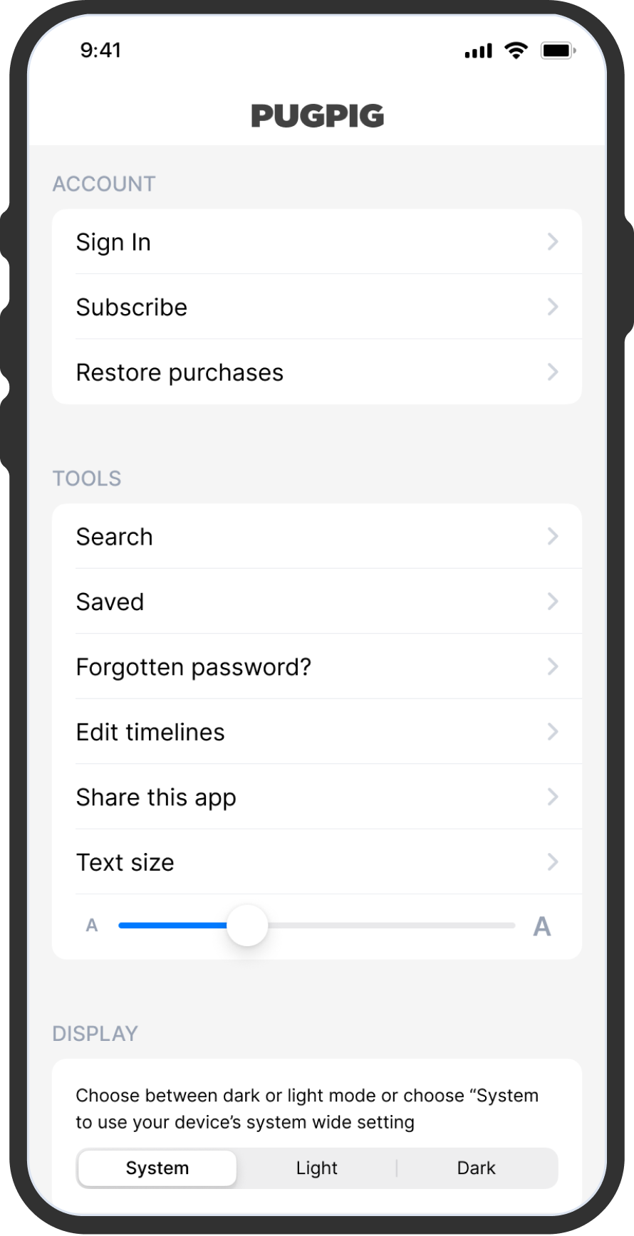
Settings Page
Your settings page can be split into as many sections as you'd like, which can be particularly useful for highlighting the difference between account-related options and user customisation options. You can give these sections titles, or not, that's up to you. Since the settings function is presented as a tab, it is commonly positioned within the app's bottom tab bar. It can occupy any of the 5 available slots, but it's often situated as the last item on the tab bar. Additionally, you also have the option of featuring the settings as an icon in the toolbar, located at the top-right corner of the app.
Appearance
As for styling you have a few options to change:
- The background colour
- The separating line between each settings item
- Section header font and font colour (Note - the capitalisation is unchangeable as we use the OS settings options)
- Settings item font, font colour and background colour
- Toolbar background colour, font and font colour
What we need from you:
- Please confirm what you want in the settings page
Paywall
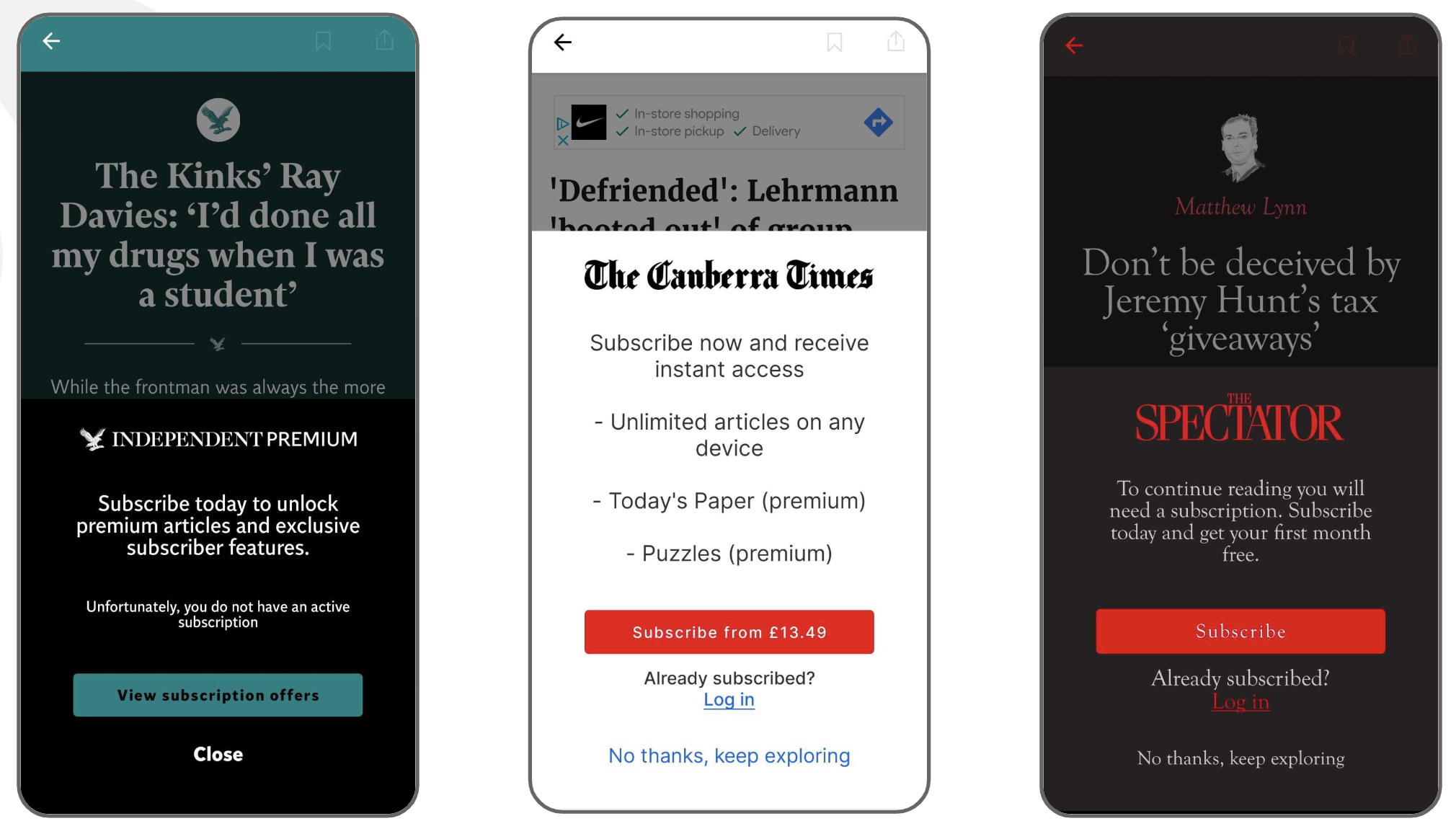
The Bolt paywall is presented to users when they try to view content that they aren’t entitled to, and guides them in how they can gain access.
We’ve designed the paywall to work with publications offering in-app purchases, third party authentication (either using our UI or a web-based login flow) or, as in most cases, both of these options.
Theming
You can choose all of the colours and fonts on the paywall, as well as the logo icon, though initially these will inherit the theming of the rest of the app to appear cohesive and this is often sufficient.
Buttons
The order, size and shape of the buttons is fixed. We apply logic to display only the buttons that are relevant to the user and app. They can be themed independently of one another.
- In app purchase: this button will appear if there are IAPs configured and available. This links to our subscription modal where the user can choose and purchase any available subscription.
- 3rd party authentication: this button will appear if an auth service is configured and the user is not already signed in. This launches the sign in flow in a separate view.
- Cancel button, this closes the paywall and returns the user to where they were prior to invoking it.
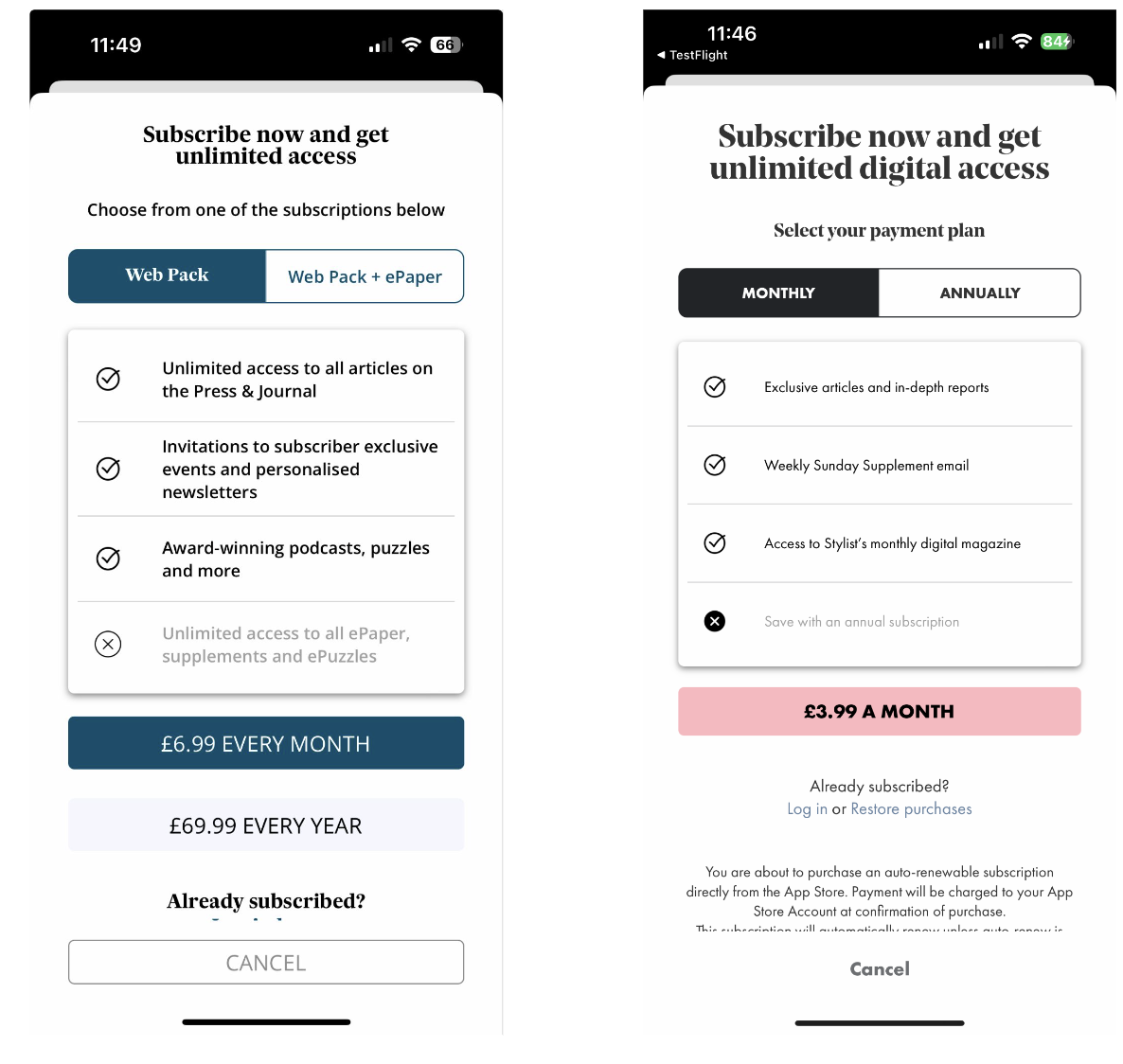
Subscription Modal
The Bolt subscription modal is presented to users to purchase a subscription via in-app purchase. This means the purchase is happening with Apple or Google Play, not directly with the publisher.
Theming
You can choose all of the colours and fonts on the subscription modal, though initially these will inherit the theming of the rest of the app to appear cohesive and this is often sufficient. You can also choose whether to offer different levels of subscription (see the example in the next slide) and durations.