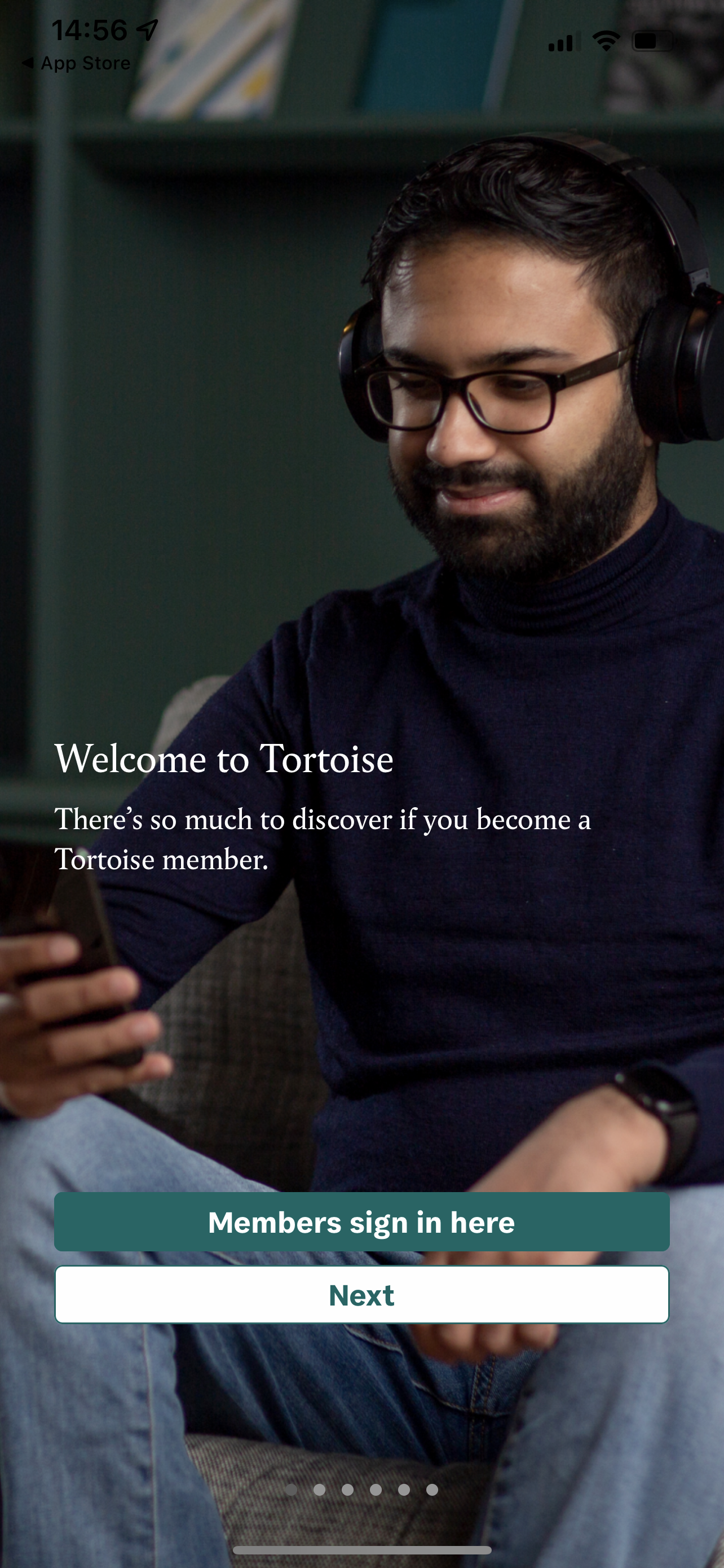
Welcome Screens on Pugpig Bolt
Welcome screens in Pugpig Bolt serve as an introduction to your app's features, guiding users effectively upon their first interaction.

Written by Emillie Ruston
Updated at May 7th, 2025


Table of Contents
When Do Welcome Screens Appear?
- Initial Launch: Displayed only on the first app launch post-installation.
- App Updates: Not shown after updates unless the welcome screens feature is newly implemented.
Components of a Welcome Screen
Each screen can include:
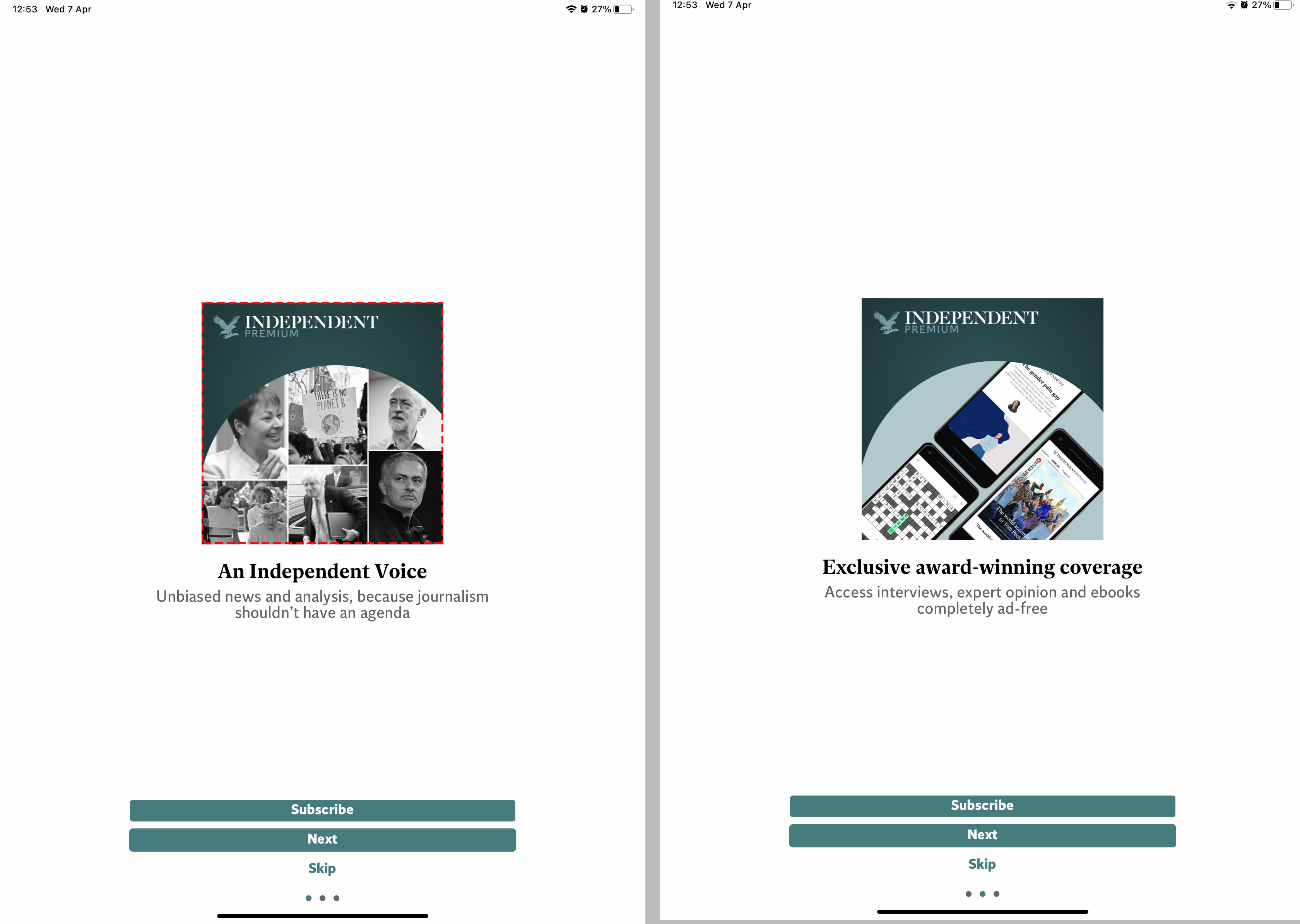
- Image (Optional): Positioned above the text. Provide a large transparent PNG; no fixed size, but it should fit within the top half of the screen. Oversized images may overflow, varying by device.
- Title: Concise headline introducing the screen's purpose.
- Body: Brief explanatory text supporting the title.
-
Action Buttons:
- Navigation: 'Next' for intermediate screens; 'Let’s go' for the final or sole screen.
- Call to Action (CTA): Deep links to app sections like login or subscription pages. Note: Only the CTA on the last screen will dismiss the welcome sequence. CTAs on earlier screens load content in the background.
- Swipe Indicators: Optional dotted indicators for multi-screen navigation.
Customisation Options
- Text & Button Styling: Adjust fonts, colours, and alignment (left, centre, right).
-
Conditional Display: Show screens based on user status:
- Active Subscriber: Tailor content for subscribed users.
- Store Subscriber: Customise for users subscribed via app stores.
- Inactive User: Target users who are registered but lack content access, e.g., prompt to subscribe.
Image Specifications
General Guidance
- No strict size requirements; images are centred in the top half and may overflow if too large.
- Images may behave differently depending on image dimensions, resolution of device screens, or operating system.
- Provide large transparent PNGs for optimal sizing across devices.
Examples
Here are some key examples, with red line marking the edge of image:
Image with Transparent Background
- Dimensions: 1500px x 1500px
- Resolution: 220 dpi
- Format: PNG
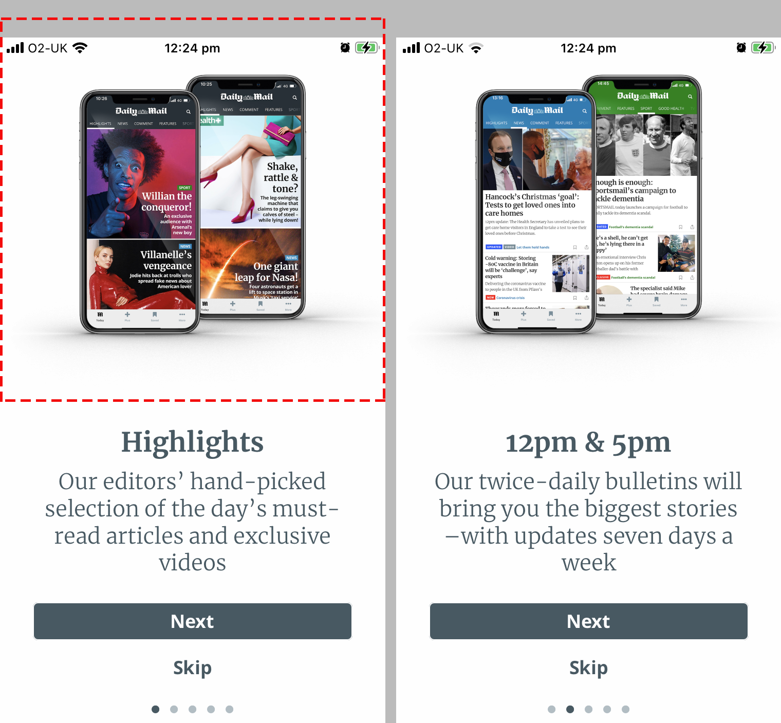
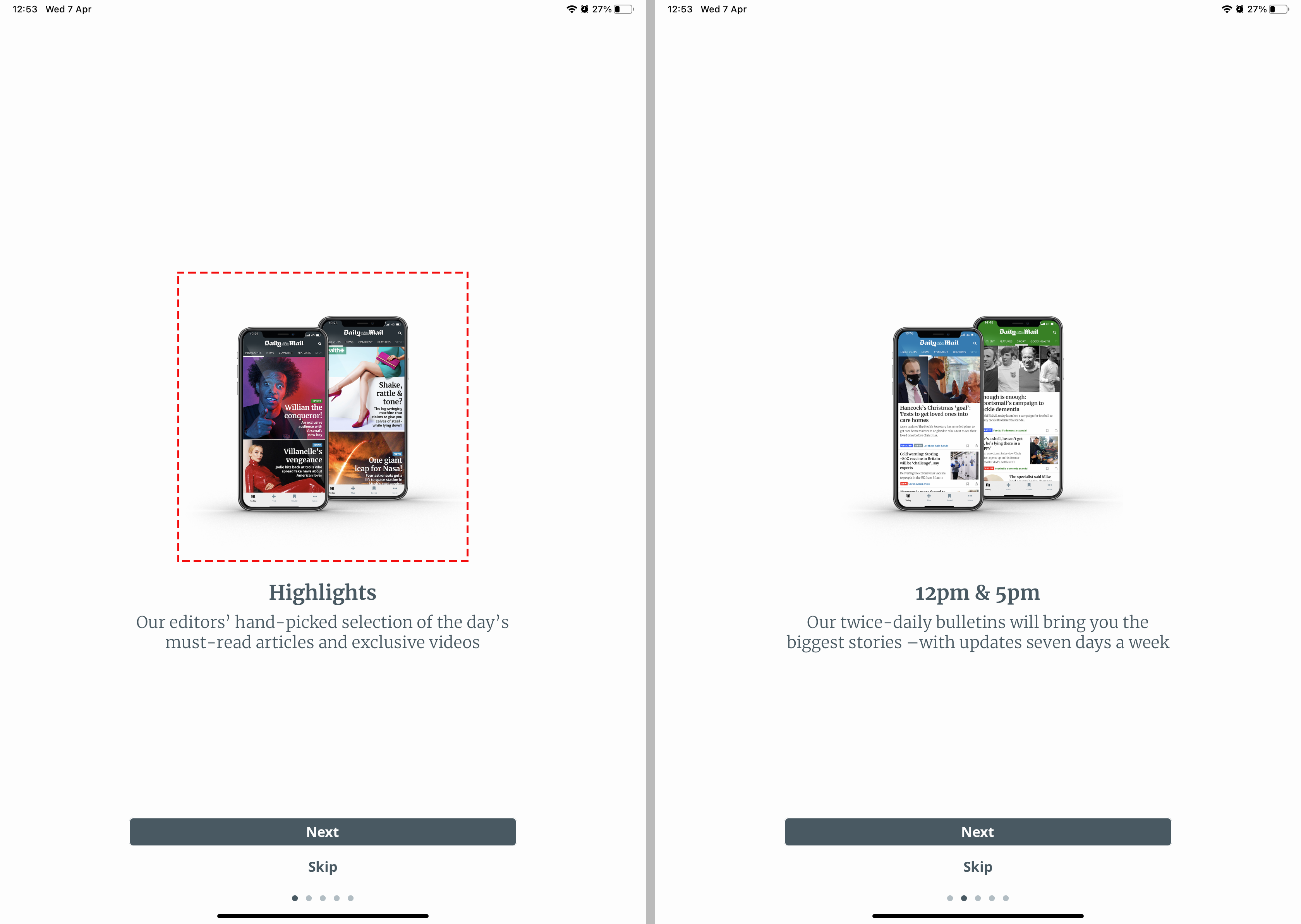
Image with Solid Background
- Dimensions: 1250px x 1250px
- Resolution: 72 dpi
- Format: PNG
Full Screen Image
- Dimensions: 1200px x 2133px
- Recommended for full-bleed, edge-to-edge presentation
- Avoid embedding text in the image - use the screen’s text functionality for better consistency and accessibility
Implementation Checklist
To set up your welcome screens:
- Decide on the Number of Screens: Keep it minimal for user engagement.
-
Prepare Content for Each Screen:
- Title
- Description
- Image (if applicable)
- Action Buttons with appropriate labels and deep links
-
Design Considerations:
- Choose fonts and colors aligning with your brand.
- Determine text alignment preferences.
-
User Segmentation:
- Define which screens are shown to different user types (e.g., subscribers vs. non-subscribers).
-
Provide Assets:
- Images as per specifications.
- Font files (.ttf or .otf) and color codes, if different to existing fonts in app.